
GCSE Physics (OCR A)
Topic Summaries
Science skills: Presenting and using data
Presenting data
- Frequency tables are used to record results from experiments. The first column should be the independent variable, and headers should include units.
| Example frequency table | |||||
| Indepedent variable, 𝒳 (s) | Measured variable, y (m) | Calculated dependent variable, y² (m²) | |||
| 1 | 2 | 3 | Mean | ||
| 1 | 1.2 | 1.4 | 1.3 | 1.3 | 1.7 |
| 2 | 2.8 | 2.6 | 3 | 2.8 | 7.8 |
| 3 | 3.7 | 3.2 | 3.8 | 3.6 | 12.7 |
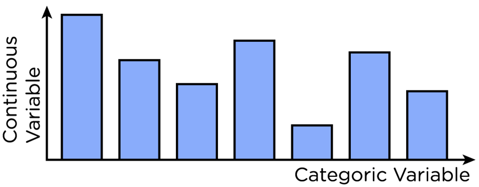
- Bar charts are used to compare categoric variables to continuous variables.
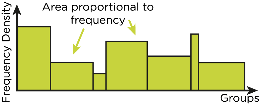
- Histograms show how a set of continuous data fits into grouped categories.
- The height of each bar represents the frequency density.
- The area of each bar is proportional to the number of data values in the group.
- The bars should all be touching.
- Line graphs compare two continuous variables.
- Recorded data is plotted onto a graph. The x and y coordinates of each point correspond to a value for the independent and dependent variable, respectively.
- A smooth curve is drawn to show the general relationship. This should be close to as many points as possible, excluding outliers.

Unlock Presenting data
Sign up to unlock the rest of this topic — plus every other topic, video, flashcard set and eBook guide in your SnapRevise+ subscription.
Cancel anytime — instant access the moment you sign up.
Report an Issue
Spotted something wrong? Let us know and we'll take a look.